This summer I was welcomed by the team at Rock & Bloom as a design intern. Fresh out of school as a Graphic Communications grad, this was the most amazing experience I could have asked for.
Since this was my first gig in the design world, I didn’t have many expectations at the start. My main hope was to learn more about my craft, but Rock & Bloom totally exceeded that.
Always sharing, always learning
The entire crew was so open, always sharing what they know and making me feel right at home. They’re always ready to help you out with any questions you have, and they genuinely want you to grasp the reason behind the ‘why’ in terms of how we do things. They’re also really on the ball, aiming for top-notch quality in every project while staying on track.
Work-life balance for the win
Making sure I’m prioritizing a good work-life balance was new to me. I’ve never had coworkers who genuinely care more about their people than about the next job on the list. The team at Rock & Bloom always has your back and are always wanting to help you out. Their consistent support and flexibility creates such a supportive environment.
A place to be who you are
In addition to excelling in their roles, every member of the Rock & Bloom team are genuinely wonderful individuals. I found myself laughing harder at our numerous Slack channels than I ever thought possible, whether it’s the high-stress debates over where to have lunch or the impeccable GIF responses.
The team that plays together, stays together
Another awesome aspect of Rock & Bloom is their homecoming week. Homecoming week is an entire week packed with good food, good times, and yeah, a bit of work too. Every employee (even the remote ones in Toronto and Vancouver) gather in-office to play games and bond as a team. It got pretty heated with a competitive Jeopardy game and multiple rounds of ‘Heads Up’ that somehow morphed into a full-blown sing-along. I can’t express how fun it was to work with these people.
I wouldn’t have changed anything about my time here at Rock & Bloom. I learned so much from an amazing group of people.
Your brand’s identity is its personality. A brand identity is the basic foundation for brand awareness, it differentiates you from other competitors in the market, and it plays an essential role in all of your marketing efforts.
A brand identity is so much more than just a logo. It’s all of the values and brand elements that go into creating a cohesive branding experience. However, in this journal we will focus on the importance of the logo.
They say never to judge a book by its cover; unfortunately that doesn’t apply to brands. Your brand’s logo is the face of your brand. It’s the first thing that people see and is often used to capture attention. The difference between a good logo and a bad logo can truly make or break your business.
A strong logo is memorable, builds customer loyalty, and communicates your brand’s story. When done right, it should communicate exactly who you are and what you stand for.
At Rock & Bloom, we specialize in helping brands find their voice and tell their story. Sometimes that means building from nothing and sometimes that means evolving and growing. In the case of these brands – their old logos were no longer serving them. They didn’t align with their future goals, didn’t reflect their values, and didn’t tell the right story.
Here are five before & afters of brands who changed their logo to strengthen their brand identity.
Before
After
Autobox
Autobox, formerly known as Saskatoon Custom Garage Interiors, needed a brand that could position them above the rest, for their quality products and exceptional customer service.
Despite being in business for over 13 years, Saskatoon Custom Garage Interiors had very little exposure as a brand. With a new owner and a new showroom being built, there was an immense opportunity to scale the business and capture more market share.
We wanted to position them as a premier garage interior design and product store. We decided to take inspiration from Italian automakers and high-end racers. In Italian ‘box auto’ translates to ‘garage’. We liked that it was one word, simple to remember, and sounded high-end. For the colour palette and the lines, we took inspiration from the original Ford GT40.
Before
After
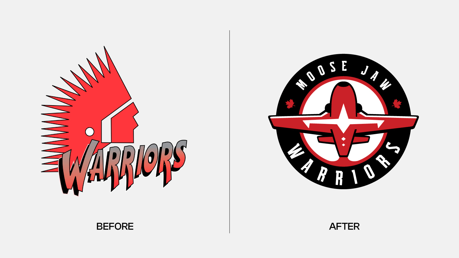
The Moose Jaw Warriors
A proud member of the Western Hockey League, the Moose Jaw Warriors released a new brand logo ahead of the 2022-23 season. The logo change comes after the Warriors announced an official review of their primary logo on October 1, 2020.
We were honoured and privileged to have worked alongside the Moose Jaw Warriors on this rebrand, creating an inclusive logo that represents Moose Jaw’s history.
A lot of thought and attention to detail went into the new logo. The design is inspired by the organization and the community’s connections with the Royal Canadian Air Force, 15 Wing Moose Jaw, and the Canadian Forces Snowbirds, 431 Air Demonstration Squadron. Over the years, the organization and the Snowbirds have built a strong relationship. In 2019, the Warriors were officially appointed as members of the Honorary Snowbird Society.
Before
After
SK Startup Institute
SK Startup Institute, formerly known as Square One, came to us with the goal of renaming and rebranding the program in the hopes that it would reach more entrepreneurs across Saskatchewan. The ‘Square One’ name and brand wasn’t having the impact that the organization had envisioned.
The new logo is simple, yet powerful. The Saskatchewan icon representing our Prairie home sits next to the wordmark. Both work on their own, but come together to create a logo that perfectly encapsulates the program.
Before
After
Hometown Homes
Custom home builder, Hometown Homes wanted a logo that represented their hometown roots. They are down-to-earth and grounded, and they wanted their colours and logo to reflect the feeling you get while working with them.
The new logo elevates their look and represents their commitment to quality. It’s warm and inviting; a brand that customers can feel at home with.
Before
After
Warrior Physio
Warrior Physio wanted their mission to be evident in their brand identity but felt that it was lacking that connection. The old logo featured a yoga pose, which didn’t apply to their business, and the overall brand wasn’t speaking to the right audience.
We opted for a logo that is clean and simple. The word Warrior stands on its own and evokes strong feelings without the need for bells and whistles. The logo is bold and in motion. The movement in the letters creates a rhythm of movement that draws your eye to the word “warrior.” It is strong but also provides a welcoming feel to potential new customers.
When you visit a website or look at a brand, what is the first thing you notice?
Is it the colours? The logo? The icons and animations? Maybe it’s the font or the layout of the page? Whatever your answer, it likely has something to do with the work of a designer.
Design is, without a doubt, one of the most crucial parts of creating a brand. Did you know that it only takes 0.05 seconds for a person to form an opinion about your website? First impressions are truly make or break. Luckily, good design can set you up for long-term success.
Good design builds recognition, credibility, and trust. It forms lasting connections and tells a brand’s story in a compelling and authentic way. How do you guarantee good design? Well, it starts with hiring the right designers.
Jill Leclerc makes up one-third of Rock & Bloom’s superhuman design team. She eats veggies like they’re candy and is a master of gardening, which is probably why she can take an itty bitty seed of an idea and grow it into a beautiful and functional brand, all while making it look easy.
Here are some of Jill Leclerc’s top design tips:
1. Collaborate
Everyday at Rock & Bloom the design team takes part in a design standup, where they share what they’re currently working on. Leclerc says the daily standup is a beneficial way to naturally get feedback from other designers.
“We’re constantly sending each other our design work and getting each other’s opinions and suggestions,” says Leclerc. “We’ve been collaborating a lot more and it’s really impacted our work in a positive way.”
Leclerc notes that this is also where she finds her inspiration – speaking with other designers and creatives.
“I often ask ‘How would you approach this?’ or ‘What style would you go with?’ or ‘Do you think that this is too modern or too old school?’ I think the more eyes, and the more you can collaborate on a project, creates the best result.”
2. Research, research, research
“Honestly, I do a ton of research,” shares Leclerc of her personal process. “I find if I do a lot of research myself, that inspiration comes naturally because I have a really good grasp of the concept. I can just start iterating, and then not stop – it just keeps snowballing.”
One of Leclerc’s goals is to expand her research even further, and to find ways to be more inclusive in her designs.
“We do cool websites for all kinds of people and when it comes to people who are less represented than they should be, as a designer you want to make sure that they’re being represented in the right way. In the way that they want to be.”
3. Get out of your comfort zone
Leclerc says that the most challenging part of her job is doing things that are out of her comfort zone. They are also (usually) the most rewarding.
“I wasn’t trained in school for web design, so doing a website for the first time, when you’re less comfortable with the program and web design rules, is definitely the most challenging because you don’t know what you don’t know, and you don’t know what you’re supposed to know,” says Leclerc. “It kind of humbles you. You have to be okay with making mistakes and understanding that it’s okay not to be the best because you’re new to this. Does it mean you suck? No, It just means you’ve got to learn and make mistakes, and then you won’t make them the next time.”
4. Perfect is the enemy of good
One of my favourite quotes of all time goes something like this: “A work of art is never finished. It is merely abandoned.” This applies to creative works of all kinds. Striving for perfection is pointless, because even if you’re happy with the end result, you might look back at it a month later and hate everything about it. Such is the curse of the creative.
Leclerc notes that at some point she has to know when to walk away from a design, because it will never truly feel like it’s done.
5. Be open-minded
“This is the one I reiterate all the time, but the best thing I learned in school is to be open-minded,” says Leclerc. “Don’t stay attached to your designs because you’re not designing for yourself. So stay open-minded, show your work to other people, get their feedback, and really absorb what they’re saying.” In other words, being adaptable and flexible as a designer leads to the best outcomes.
6. Mind the Dos and Don’ts
Not all websites are created equal. Here’s a quick breakdown of Leclerc’s website design dos and don’ts.
Do:
Be consistent
Create a user-path that involves the least amount of clicks
Make important information easily accessible
Keep pages scannable
Use high-quality, original photography where possible
Have fun with it! Hidden Easter eggs and quirky 404 pages are simple things that can really elevate a website
Don’t:
Mix too many fonts
Have low contrast text
Settle for default illustrator colours
Use a really stark colour palette
Use different stroke weights on graphics incidentally
Try to do everything. Make design choices intentionally.
Design work involves a lot of things that the average person might not think to look for when they visit a website, but the overall experience matters greatly.
“People can go to a website and say, ‘Oh, that looks bad,’ but might not be able to pinpoint why it’s bad,” says Leclerc. “And usually it’s a combination of fonts or weights or brushstrokes or colors. There’s all of these different things that go into creating a good design that the average person isn’t thinking about, but would notice if it were off.”
Looking ahead
Brands are constantly growing, and since the onset of COVID-19, they’ve had to adapt at a quicker rate than usual.
“People can’t get away with not having a website anymore or not having a social media presence,” says Leclerc. “And some people had a really hard time before COVID, understanding how important that was. Anyone who was a little bit skeptical regarding the effectiveness of a website, now believes in having an online presence.”
Moving forward Leclerc thinks that brands will try to humanize themselves more and focus on building stronger relationships with customers.
“It seems like designs are becoming more human, less corporate. I find more brands want to connect with people in a personal way rather than a corporate way. The world is becoming less suits to work, more pajama pants while working from home at your computer.”
As for Leclerc, she’s very content in her pajama pants, but much like the gardener she is, also excited to grow. “I’m only starting out in my career. And I know that, if in the future, my goals or my dreams change, Rock & Bloom is willing to adapt with me. They have the flexibility and want to see everyone grow. I know that it’s never going to be, “That’s not your lane. Stay there. Just stay small.’ It’s more like, ‘Where do you want to go and how can we help you get there?’”
Colour has power. Studies have shown It can impact how we learn, think, and behave. Colour can tell us what to pay attention to and even influences our purchasing behaviours. By using the right consistent colours, your brand can establish trust, familiarity, and evoke emotional cues from your customers.
Yes, you can choose a few colours based on what you like, but if you want to build a great brand, choose your colours strategically with your customers and business goals in mind. Try this trusted and true process for choosing brand colours that resonate with your audience and propel you toward your company’s vision.
The 6 Step Process to Choosing the Perfect Colours for Your Marketing, and Your Brand:
Determine your brand personality
Determine your audience
Know your competitors
Select colors based on psychology
Test it
Keep it consistent
Think about how you want people to talk about your business when you are not in the room. Is your business playful or serious? Young or mature? Elite or for the masses? Colour can help convey how your brand is perceived.
Step 1: Know Your Personality
Mcdonald’s is a brand built on happiness. They want every interaction with them to be a “feel good moment.”. Historically they have been a red brand with a touch of yellow. In their latest brand reveal, McDonald’s has shifted the emphasis to yellow instead. This refocus helps their brand evoke more feelings of warmth, joy, optimism, and excitement. It also helps differentiate their brand from others in the restaurant industry, which has defaulted to red. “Too much red in the brand felt aggressive and shouty,” says Colin Mitchell, VP Director Global Brand, McDonald’s. “You can’t help but feel happy when you see the sunshine yellow.”
Photography: Andrew Meredith
Step 2: Know Your Audience
Who are you trying to reach? Where is your market? What kind of emotions do you want them to feel? Is there a colour that resonates more to them? Think about who your main audiences are, and put yourselves in their shoes. Or better yet, ask them if you can! Keep in mind that colour can mean different things in different cultures. Knowing your audience is key. Beyond their background and demographic info, include things like their goals, challenges, what a day in their life looks like, routines and online behaviours, personality, brand affinities, quotes, and marketing messages.
Food packaging is a huge factor in our purchasing decisions. Brand colours need to be cohesive and memorable —eye-tracking studies show that consumers read on average only seven words in an entire shopping trip, buying instinctively by colour, shape and familiarity of location. Think of a wander through the cereal aisle. What do the Trix rabbit, Tony the Tiger, Toucan Sam, and Cap’n Crunch have in common? They’re all bright, cheery cartoon characters. That’s because they all have the same audience — young children. Would a black and white cereal box be picked off the shelf by an eight-year-old? Doubtful.
Step 3: Know How You Compare
If your main competitor is using the colour red, you likely do not want do the same. Whether you are rebranding or creating something new, test your brand next to your competitors. It’s important to be memorable and catch your target audience’s eye. Standing apart is great, but it’s important that your brand still fits in –- using colours that are too unique can actually have a negative impact on your brand.
Step 4. Know Colour Psychology
Colour has an impact on how we think, feel, and behave. There are many studies on the psychological effects of colours, but when it comes down to it, we all have our own personal experiences that shape our view perspective and affect purchasing decisions. In different contexts, we do not all react to colours in the same way because of our background, culture, and personal experiences. Generally, though, the majority of people respond to colour in these ways:
Tends to rarely occur in nature, so it is viewed as rare and intriguing
Known to be a polarizing colour– people either really love it or hate it.
Brands: Cadbury, Fedex, Hallmark, Yahoo, Wonka
5. Test It
When it comes to choosing colours, test it out! Try colours that are associated with your brand’s personality, change combinations and placement to see what fits best. In the end, always bring it back to your business goals. Ask yourself these questions:
Are these colours bringing out my brand’s personality?
How will this make my customers feel?
How do my colours compare to my competitors?
6. Keep it Consistent
After you decide on a colour palette, keep it consistent. By using the same colours throughout your branding and marketing, your customers will become more familiar with you. Better brand recognition also increases the trust you establish with your customers.
There is much more that can be learned about colour theory in branding and marketing. From audience to industry to placement to objectives, there is a lot to think about. We love talking colour and brand — If you have more questions, contact us!